Home Inspiration
Color Choices and How They Can Affect Your Mood
By Adam Blake
Color choices we make for our homes can sometimes be a very difficult process. Our personal color preferences for clothing may not always be the same color preferences in furniture or the walls of a room. We may choose bright bold colors for flowers we like, but dark, deep colors for the interior of our kitchen. It is this wide range of use of color and choices that can make choosing specifics for your home a time-consuming and difficult process.
In order to, perhaps, add some clarity or guidelines to this color choice process, let us introduce some scientific logic and research information that just might make your life a bit simpler.
First, let’s remove from this process any attempts to integrate the color palette of your wardrobe from the paint selection of the interior walls of your home. We don’t want to give you a good reason to go out and buy all new clothes!
Next, let’s take into account the proven techniques that experience tells us can set the tone of a room along with our mood.
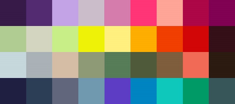
We should understand that colors behave in three basic ways: active, passive, and neutral. You can easily match the colors of your room to your personal desires, to your specific tastes and to the room’s purpose. Light colors tend to be more expansive and airy, making rooms seem larger and brighter. Dark colors typically are sophisticated and warm; they give large rooms a more intimate appearance. Let’s find out more about colors and what they can do for a room and our mood.
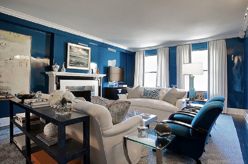
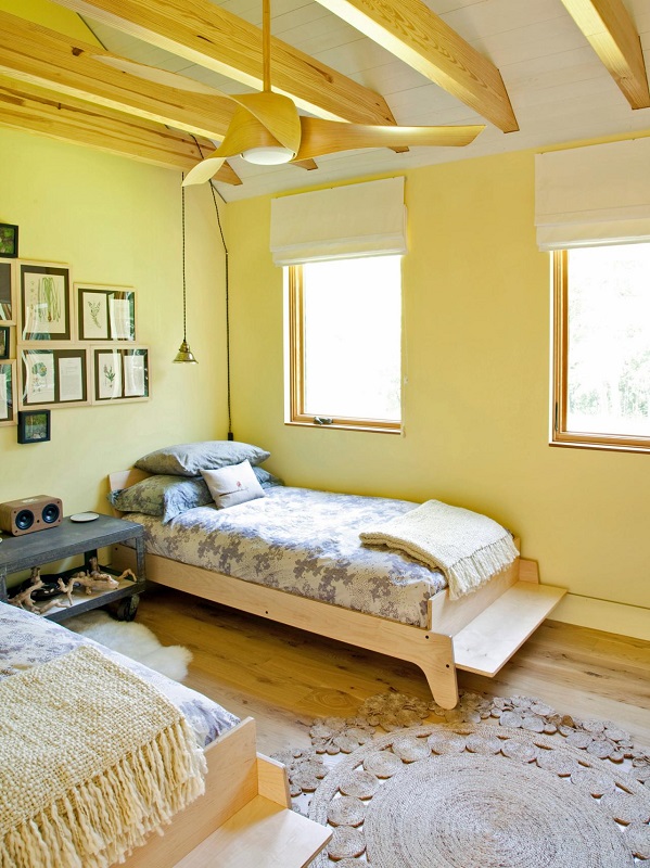
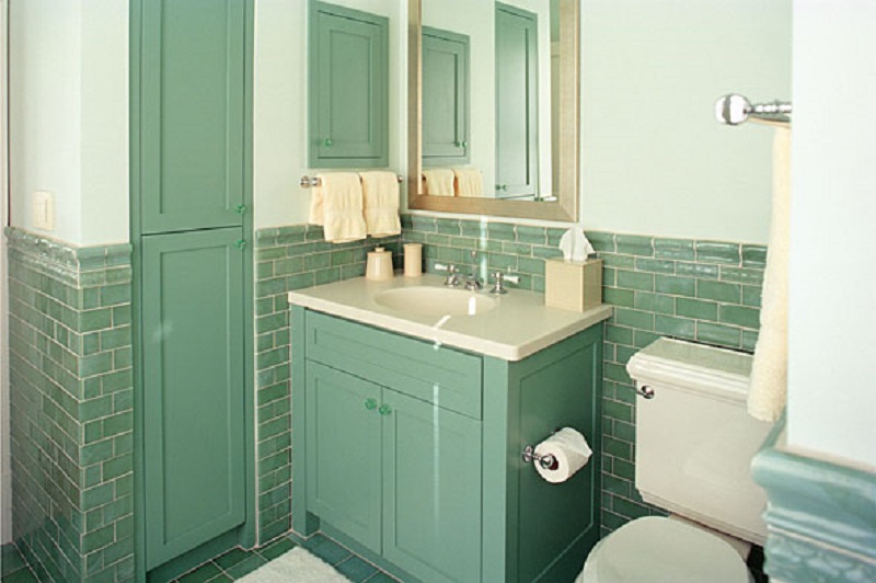
Blues are said to bring down blood pressure, slow respiration and our heart rate. That’s why it is considered calming, relaxing and serene, and it is often recommended for bedrooms and bathrooms. Be careful, however: a pastel blue that looks pretty on the paint chip can come across as unpleasantly chilly when it is on the walls and furnishings, especially in a room that receives little natural light. If you opt for a light blue as the primary color in a room, balance it with warm hues for the furnishings and fabrics. To encourage relaxation in the social areas (family rooms, living rooms, large kitchens) consider warmer blues, such as periwinkle, or bright blues, such as cerulean or turquoise. Blue is known to have a calming effect when used as the main color of a room. Go for softer shades of blue. Dark blue has the opposite effect, evoking feelings of sadness. So refrain from using darker blues in your main color scheme. Stay with the lighter shades of blue to give you and your loved ones a calm effect.
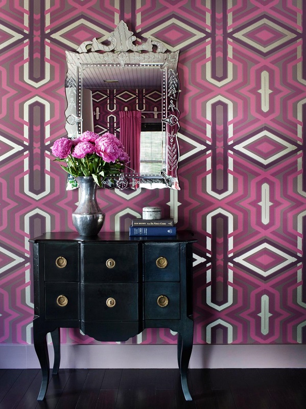
Purple in its darkest values (eggplant, for example) is rich, dramatic, and sophisticated. It is associated with luxury as well as creativity, and as an accent or secondary color, it gives a scheme depth. Lighter versions of purple, such as lavender and lilac, bring the same restful quality to bedrooms as blue does, but without the risk of feeling chilly.
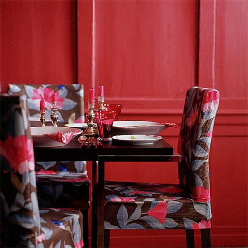
Red raises a room’s energy level. It is a good choice when you want to stir up excitement, particularly at night. In the living room or dining room, red draws people together and stimulates conversation. In an entryway, it creates a strong first impression. Red has been shown to raise blood pressure, speed respiration and heart rate. It is usually considered too stimulating for bedrooms, but if you’re only in the room after dark, you’ll be seeing it mostly by lamplight, when the color will appear muted, rich, and elegant. Red, the most intense, pumps the adrenaline like no other hue.
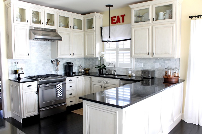
Yellow captures the joy of sunshine and communicates happiness. It is perfect for kitchens, dining rooms, and bathrooms, where happy colors are energizing and uplifting. In halls, entries, and small spaces, yellow can feel expansive and welcoming. Even though yellow although is a cheery color, it is not a good choice to use in main color schemes when it comes to designing a room. Studies show that people are more likely to lose their temper in a yellow interior. Babies also seem to cry more in a yellow room. In large amounts, this color tends to create feelings of frustration and anger in people. In chromotherapy, yellow is believed to stimulate the nerves and purify the body.
Green is considered the most restful color for the eye. Combining the refreshing quality of blue and the cheerfulness of yellow, green is suited for almost any room on the house. In the kitchen, green cools things down; in a family room or living room, it encourages unwinding but has enough warmth to promote comfort and togetherness. Green also has a calming effect when used as a main color for decorating. It is believed to relieve stress by helping people relax. Also believed to help with fertility, making it a great choice for the bedroom.
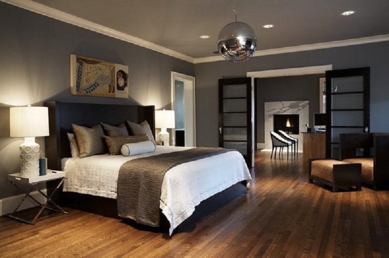
Neutrals (black, gray, white, and brown) are basic to the decorator’s tool kit. All-neutral schemes fall in and out of fashion, but their virtue lies in their flexibility: Add color to liven things up; subtract it to calm things down. Black is best used in small doses as an accent. Indeed, some experts maintain that every room needs a touch of black to ground the color scheme and give it depth. To make the job easier, you can rely on the interior designer’s most important color tool: the color wheel.
So, hopefully this little post about color choices and how they can affect our moods and the choices we are faced with in making our homes, a place of passion, calm, excitement and expression has inspired you to make some changes for the better in your next home renovation.
![]()
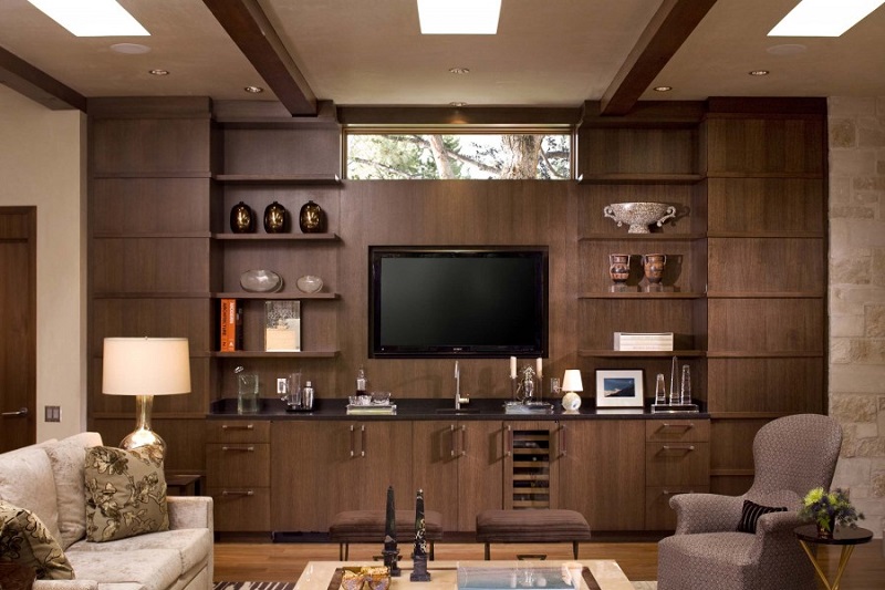
photo 1 courtesy of www.decorpad.com
photo 2 courtesy of www.hgtv.com photo library
photo 3 courtesy of www.picsdecor.com
photo 4 courtesy of www.hgtv.com photo library
photo 5 courtesy of www.vectormu.com
photo 6 courtesy of afreakatheart blog spot
photo 7 courtesy of www.homedecored.com
photo 8 courtesy of www.denoxa.com

Adam Blake
Adam Blake is Design Manager at MyHome Renovation Experts, known for blending smart space planning with timeless design. With hands-on experience guiding homeowners through renovations, he understands how to transform kitchens and living spaces into highly functional, beautifully crafted environments.
Related Posts
Converting NYC Multi-Family to Single-Family Townhouses: ALT-1 vs. ALT-2
NYC townhouse conversion projects often begin with the vision of transforming a divided brownstone or...
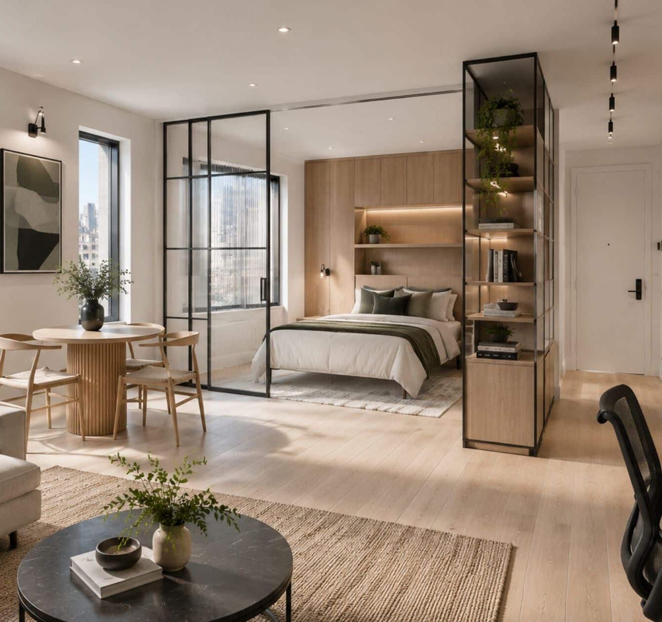
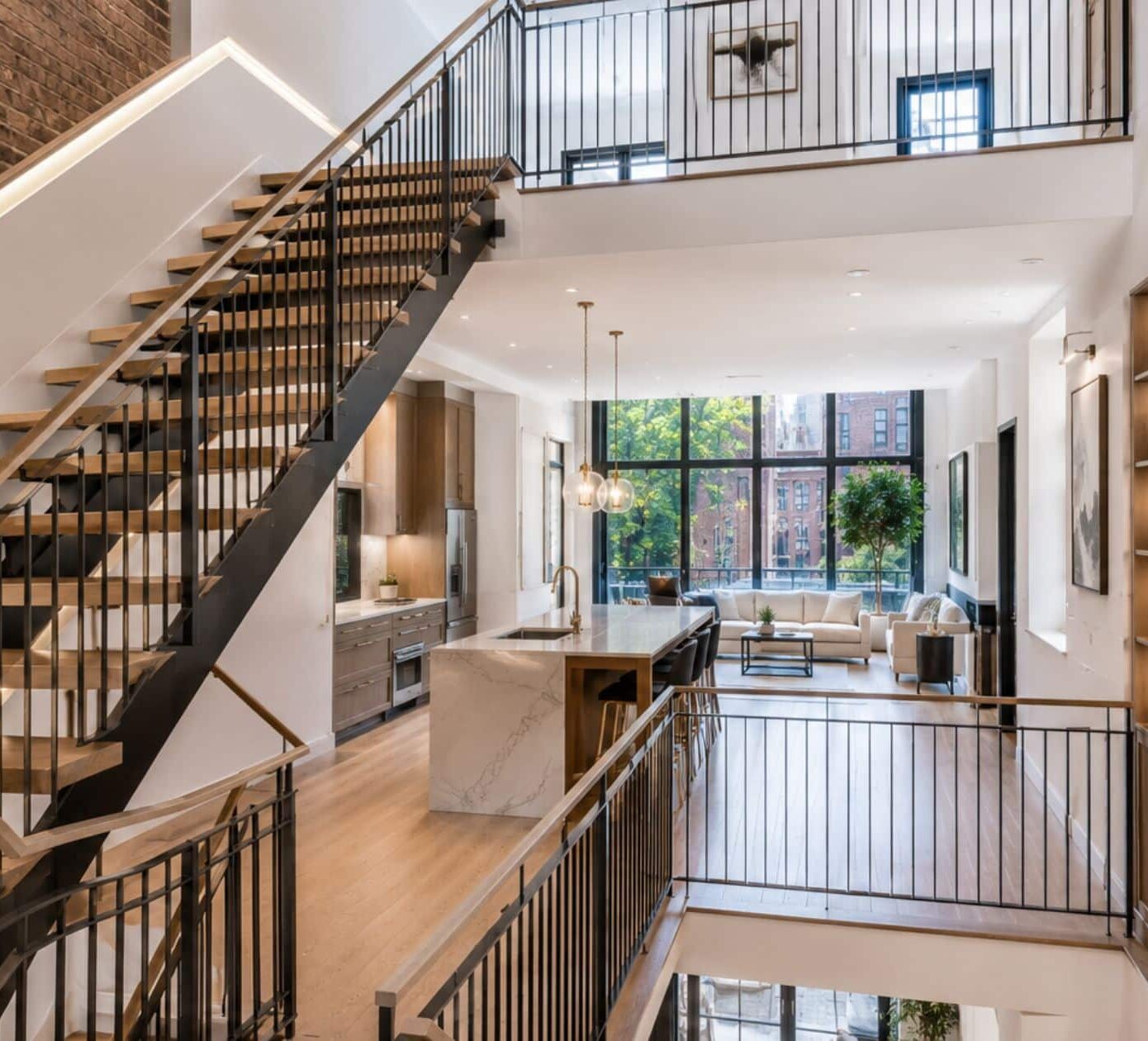
NYC Studio Apartment Renovation: How to Maximize Space with Smart Design
For the modern New Yorker, the studio apartment has officially graduated from a “starter” home...
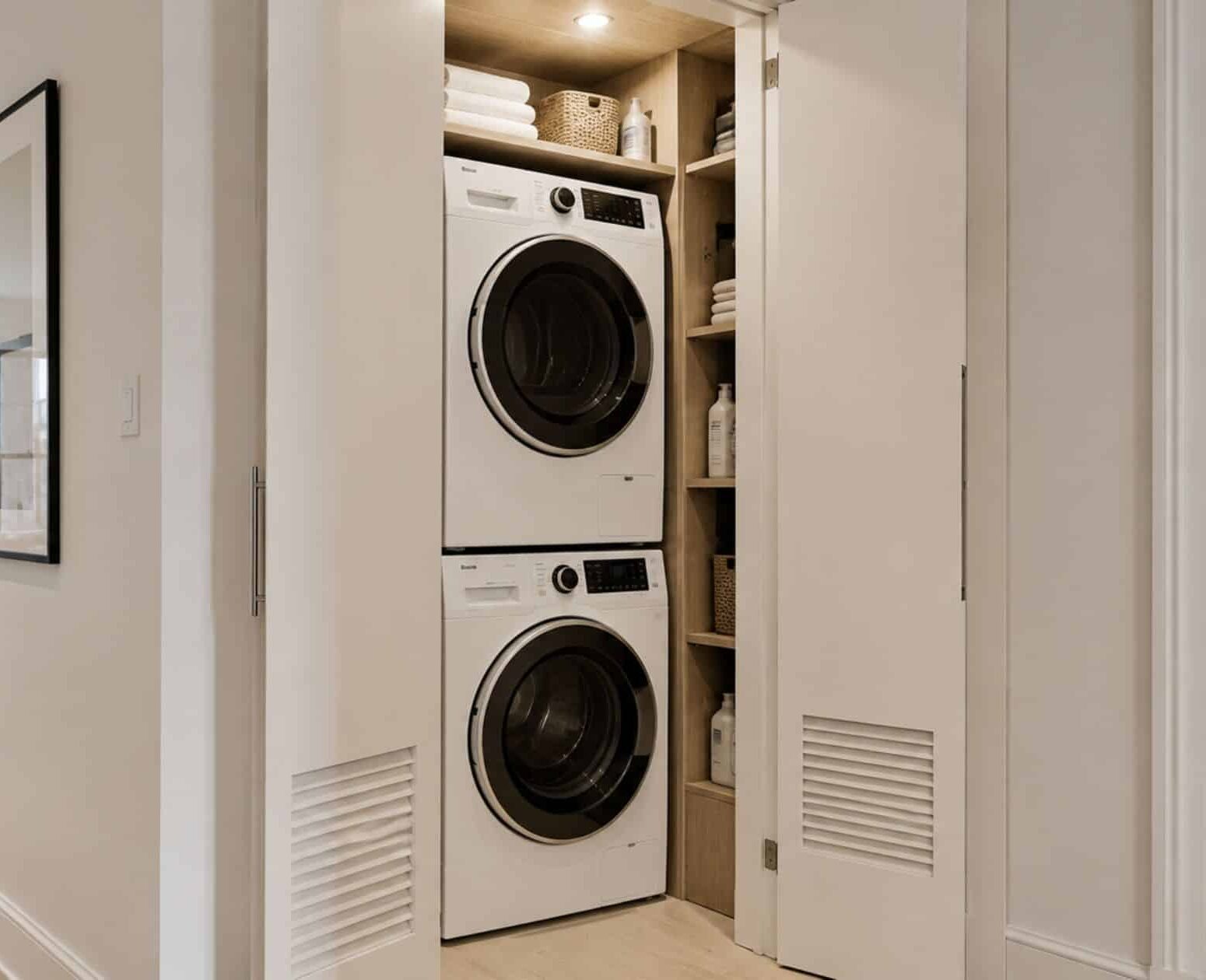
NYC In-Unit Laundry Installation: Heat Pump Dryers and Board Approval
In the hierarchy of New York City apartment amenities, there is a clear “Holy Grail”:...