Home Inspiration
Color Psychology in Interior Design: Making Your Home Feel Bigger
By Adam Blake
Your home is your sanctuary, where you unwind, entertain, and create lasting memories. Whether you live in a cozy Manhattan apartment or a spacious Brooklyn brownstone, the right colors can significantly impact the perception of space in your home.
You can select the right colors for your home by understanding color aesthetics. For instance, to make your home look more spacious, light, and airy neutrals are a great idea. Similarly, mirrors and metallics can make your apartment look more open.
This blog explores the dynamic realm of color psychology in interior design. You can make your home feel bigger by selecting an aesthetically pleasing palette for your New York City home.
Color Psychology 101 – Understanding Color Aesthetics
Color psychology studies how certain colors affect our emotions, moods, and perceptions. It is integral to interior design as you use colors to create specific atmospheres or set the mood in spaces. Color aesthetics also helps to create memorable experiences in every environment we inhabit.
In a bustling city like New York, the strategic use of color can help create the illusion of more space and an open, airy ambiance. Let’s explore the best way to use colors during home renovation.
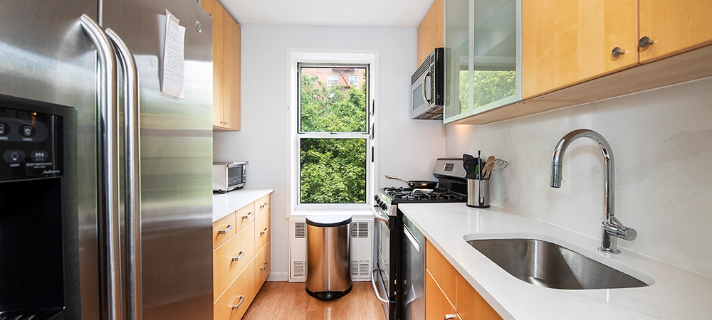
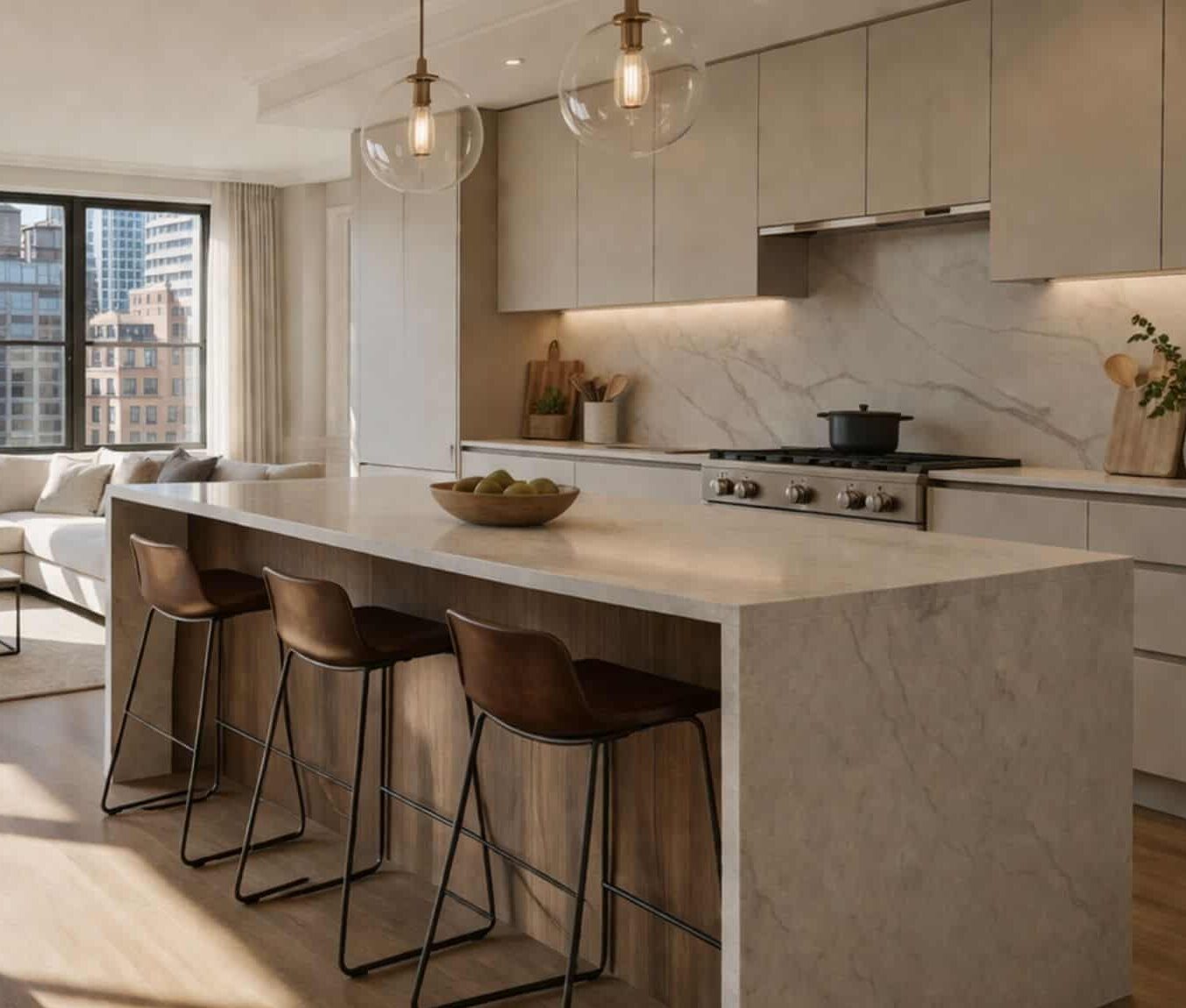
Light and Airy Neutrals
Neutral colors such as whites, creams, soft grays, and beige are classic choices that make a room more spacious. These hues reflect light, making the space appear brighter and more open.
These colors can be a game-changer in a city with limited natural light. They also create a timeless, elegant look that complements various design styles.
Don’t be afraid to layer different shades to add depth and warmth to your space when using neutrals. This can prevent it from feeling too sterile or one-dimensional. To infuse subtle contrast and interest, you can use accessories and decor items in muted pastels or soft metallics.
Cool Blues and Greens
Cool colors, such as blues and greens, evoke a sense of tranquility and serenity. They can make a room feel more spacious and open because they visually recede, creating the illusion of depth. For small apartments in NYC, where finding a quiet retreat can be challenging, these colors can offer a peaceful oasis within your home.
Incorporate cool blues and greens through wall paint, upholstery, or accents like throw pillows and artwork. These shades work exceptionally well in bedrooms and living spaces where you want to create a calming atmosphere.
Related Article: 4 Tips from the Pros About Choosing Grout Color
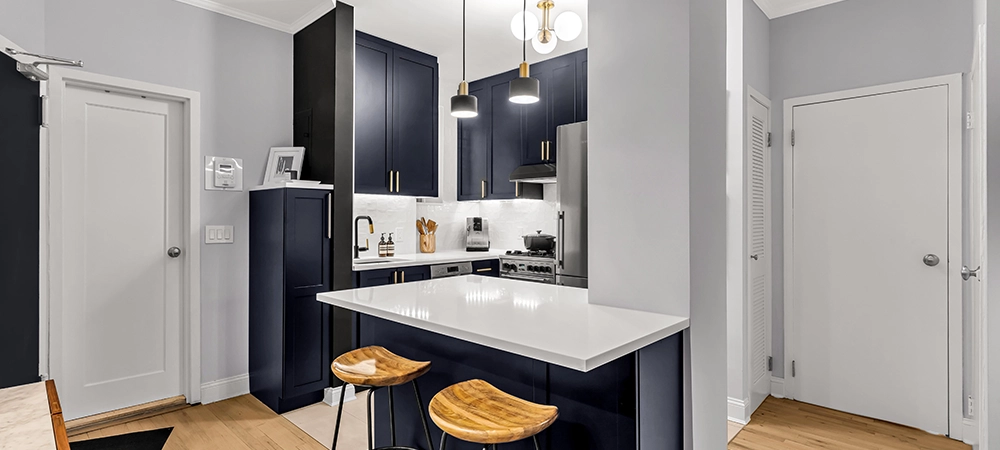
Mirrors and Metallics
Mirrors are a fantastic tool for making your home look larger and more open. They reflect light and create the illusion of a bigger space. Consider using mirrored furniture, decorative mirrors, or mirrored backsplashes in the kitchen to add a touch of glamor and maximize the feeling of space.
Additionally, metallic finishes, like silver, gold, and copper, can play a significant role in color psychology. Metallics can bounce light around the room, making it feel more expansive. To achieve a polished and visually open space, you can introduce these accents through fixtures, cabinet hardware, or decor items.
Soft Pastels
Pastel colors, including blush pink, pale lavender, and mint green, can bring a soft and airy quality to your interiors. They create a welcoming and open atmosphere in smaller rooms or cozy corners.
You can use pastels on walls, furniture, and textiles. They work well in bedrooms and nurseries, creating a gentle and harmonious environment. The key is to balance pastels with neutral or white elements to prevent the space from feeling too sugary or overwhelming.
Clever Use of Contrast
While many New York homeowners often favor light colors during home renovation for small spaces, strategic contrast can be equally effective in creating the illusion of depth and space. For instance, using a darker color on an accent wall can add dimension and make the room feel cozier without shrinking it. Dark colors can visually recede, creating a sense of depth.
Dark wood accents, bold artwork, or deep-toned furniture can strongly contrast your color scheme. Using them thoughtfully can add character and sophistication to your interior while maintaining an open feel.
Related Article: How Much Will It Cost to Paint My NYC Apartment?
Get the Best Out of Your Home Renovation with My Home US
Using the best color scheme for your home renovations can make your New York City home feel larger, brighter, and more welcoming. By making these decisions, you can turn any living space into a place of comfort that creates spaciousness despite its size.
Whether you opt for calming blues and greens, soft pastels, or clever contrast, remember the goal is to create an atmosphere that suits your personality and lifestyle. At My Home US, we specialize in helping you achieve your design goals, ensuring your home reflects your unique style while making the most of your available space.
As you embark on your quest to improve the interior of your home, remember the power of color psychology. With the right colors, our contractor can make your home feel bigger in a city that never sleeps.
Contact us at 212.666.2888 to discuss options.

Adam Blake
Adam Blake is Design Manager at MyHome Renovation Experts, known for blending smart space planning with timeless design. With hands-on experience guiding homeowners through renovations, he understands how to transform kitchens and living spaces into highly functional, beautifully crafted environments.
Related Posts
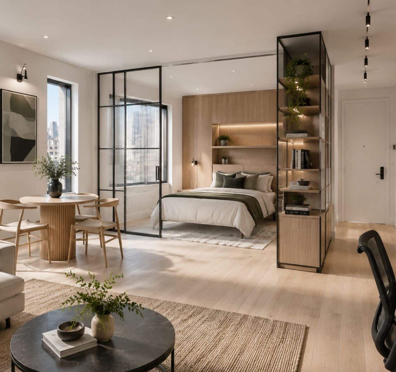
NYC Studio Apartment Renovation: How to Maximize Space with Smart Design
For the modern New Yorker, the studio apartment has officially graduated from a “starter” home...
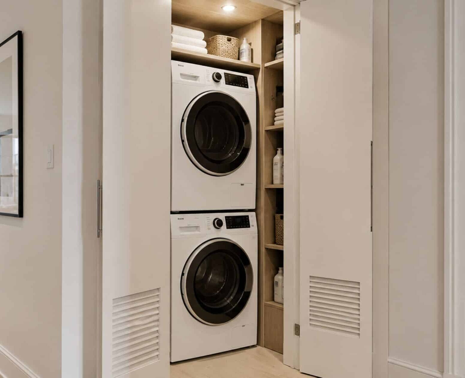
NYC In-Unit Laundry Installation: Heat Pump Dryers and Board Approval
In the hierarchy of New York City apartment amenities, there is a clear “Holy Grail”:...
Open Concept Kitchen Renovation in a NYC Apartment: Can You Remove Walls, and What Does it Cost?
Many homeowners start considering an open concept kitchen renovation in their NYC apartments when their...